Magazine print design: composition, layout and typography. Full PDF available here.
Content from «Bjarnes turblogg», available at https://bjarnesturblogg.blogspot.com/.
The Concept
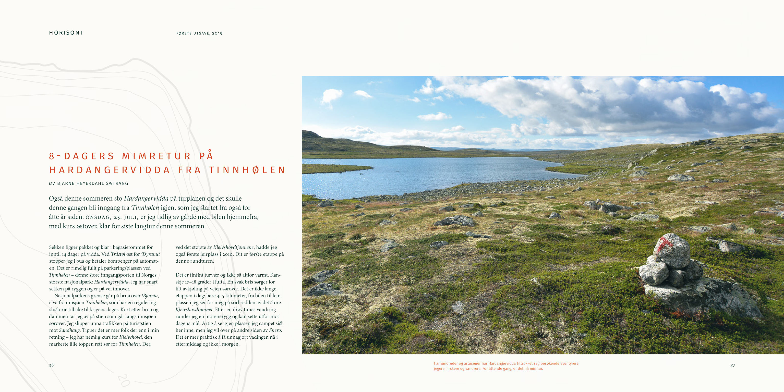
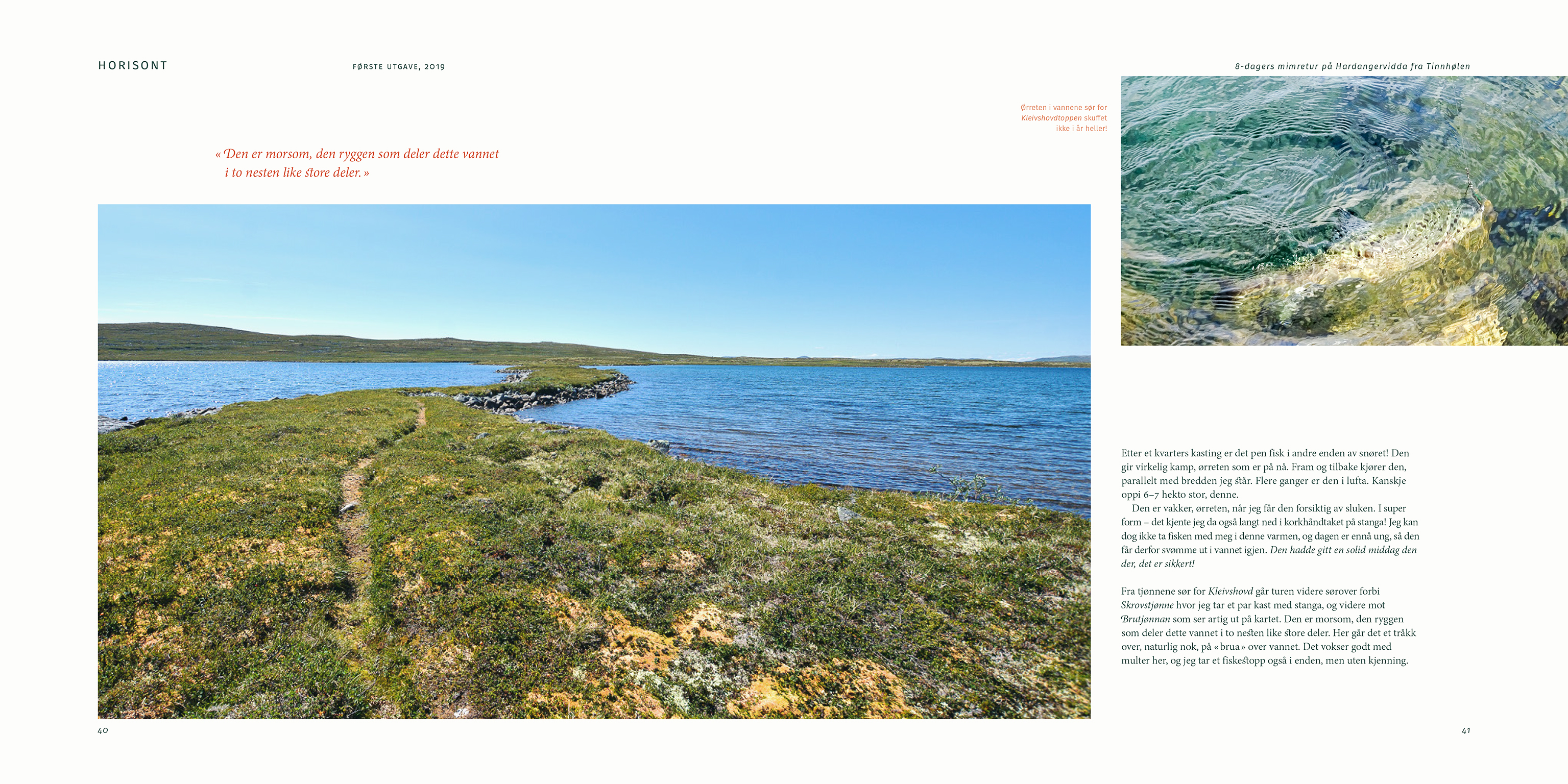
The industry that promotes nature and outdoor life in Norway tends to focus on vertical experiences – experiences that are about speed, excitement and mountain peaks. The magazine “Horisont” is about horizontal experiences – about hiking over mountain, forest and expansive landscapes.
Focus is on the meditative experience of hiking, to nourish the longing, or as relief for those awaiting their next trip.
Target audience is both men and women, with more cultured views on outdoor life. Ages from 30 to 50 years, with somewhat limited appeal from 20 to 70+. Level of education and income from medium to high.
The Process
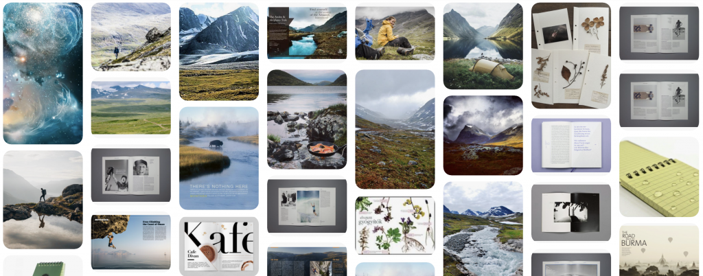
I defined the vision, concept and target audience. I then started to collect inspiration for experience attributes using a Pinterest mood board.
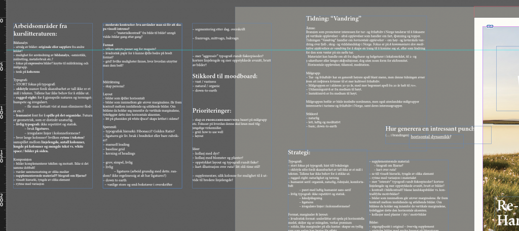
Based on concept and research I devised a strategy for typography, format, layout, composition and images.
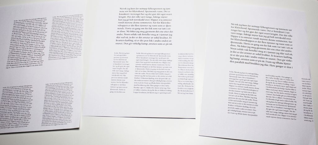
I tested typography and font sizes by printing pieces of text on paper in different versions for assessment and comparison.
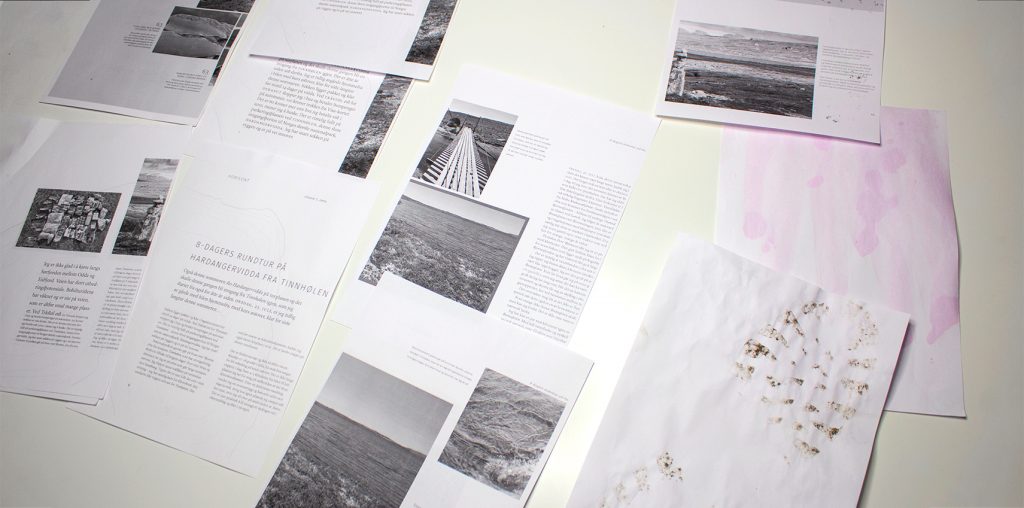
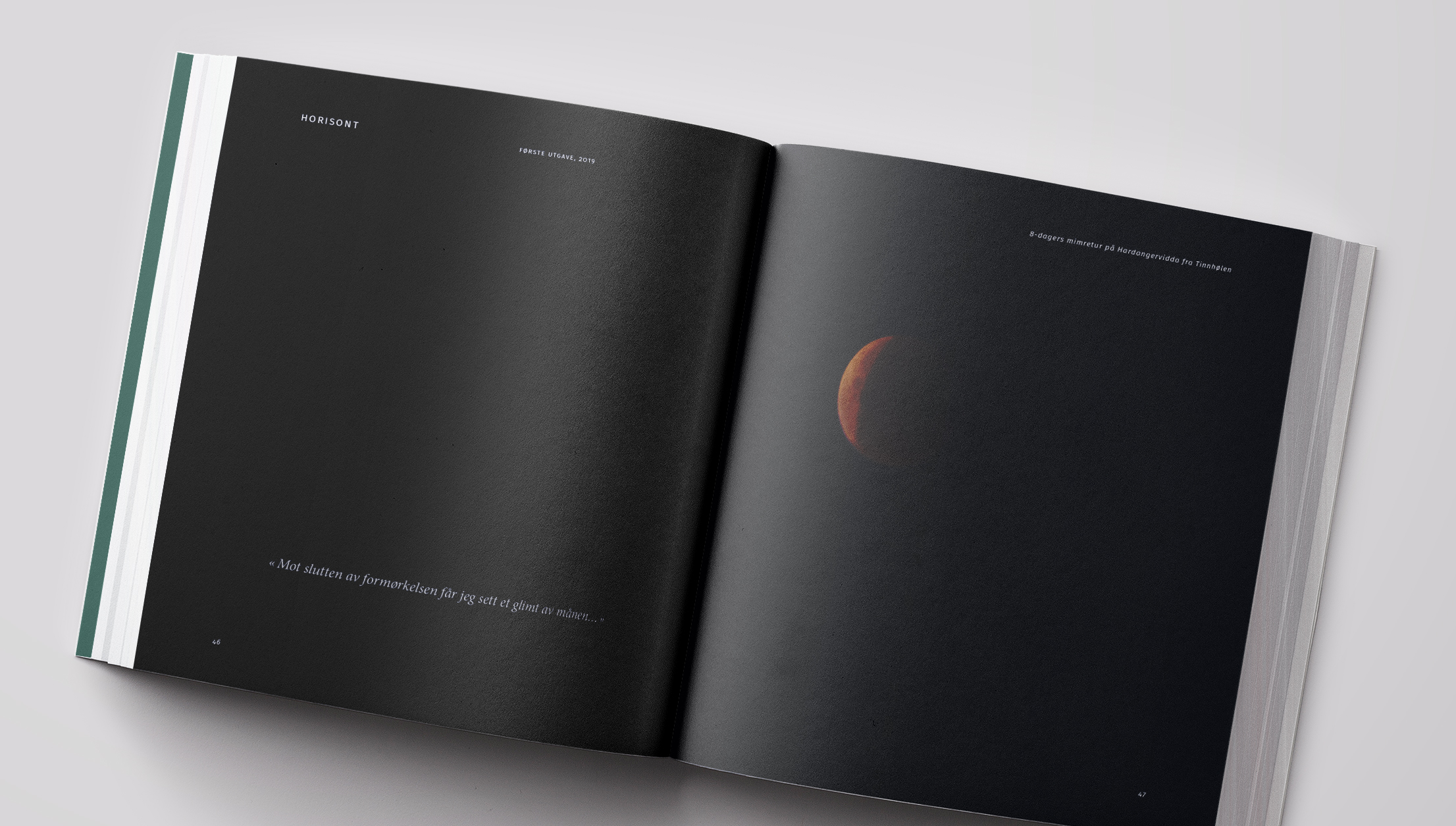
For an extra impact, I went out and stomped on a piece of paper with muddy boots and spilled lingonberry jam. The result was photographed and utilised for effect in the finished magazine.
The Result
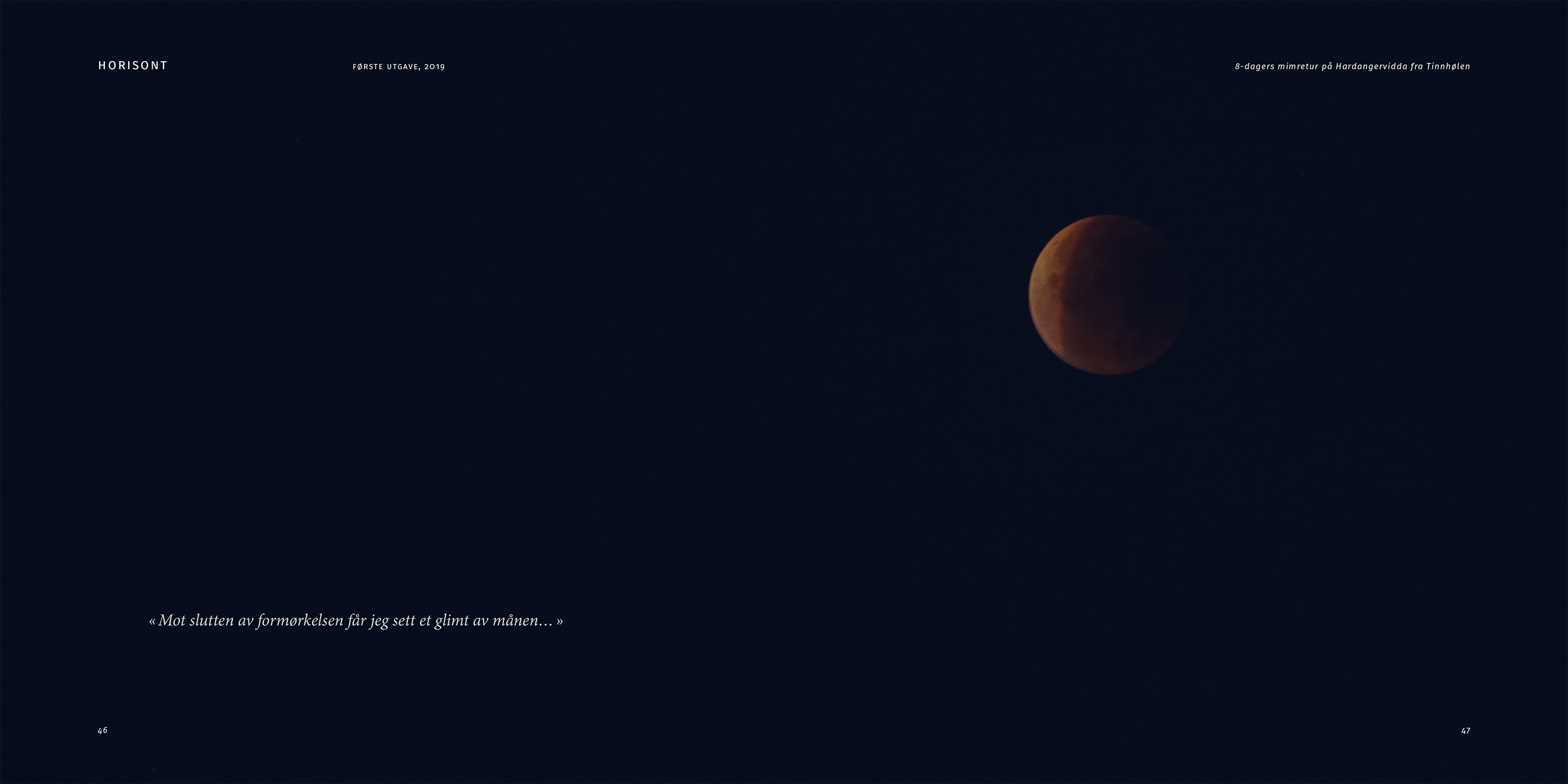
Visually, I drew inspiration from two-tone print design, limiting the color palette to a scale of muted green tones in addition to an earthy orange accent.
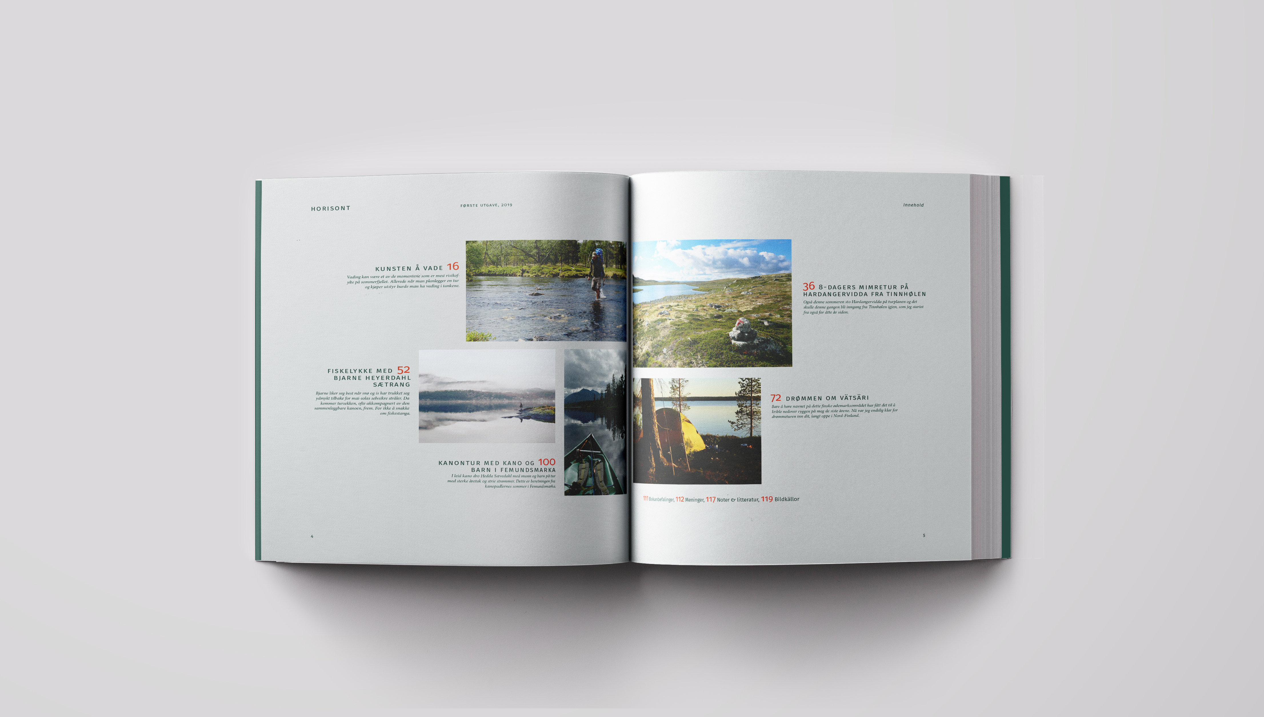
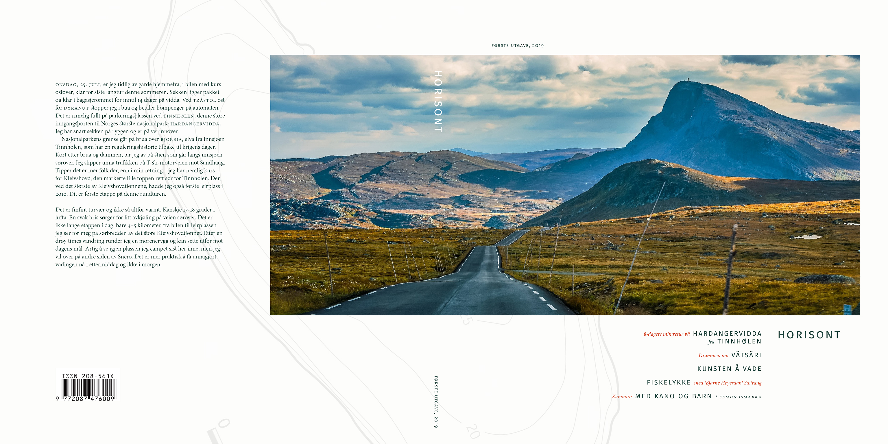
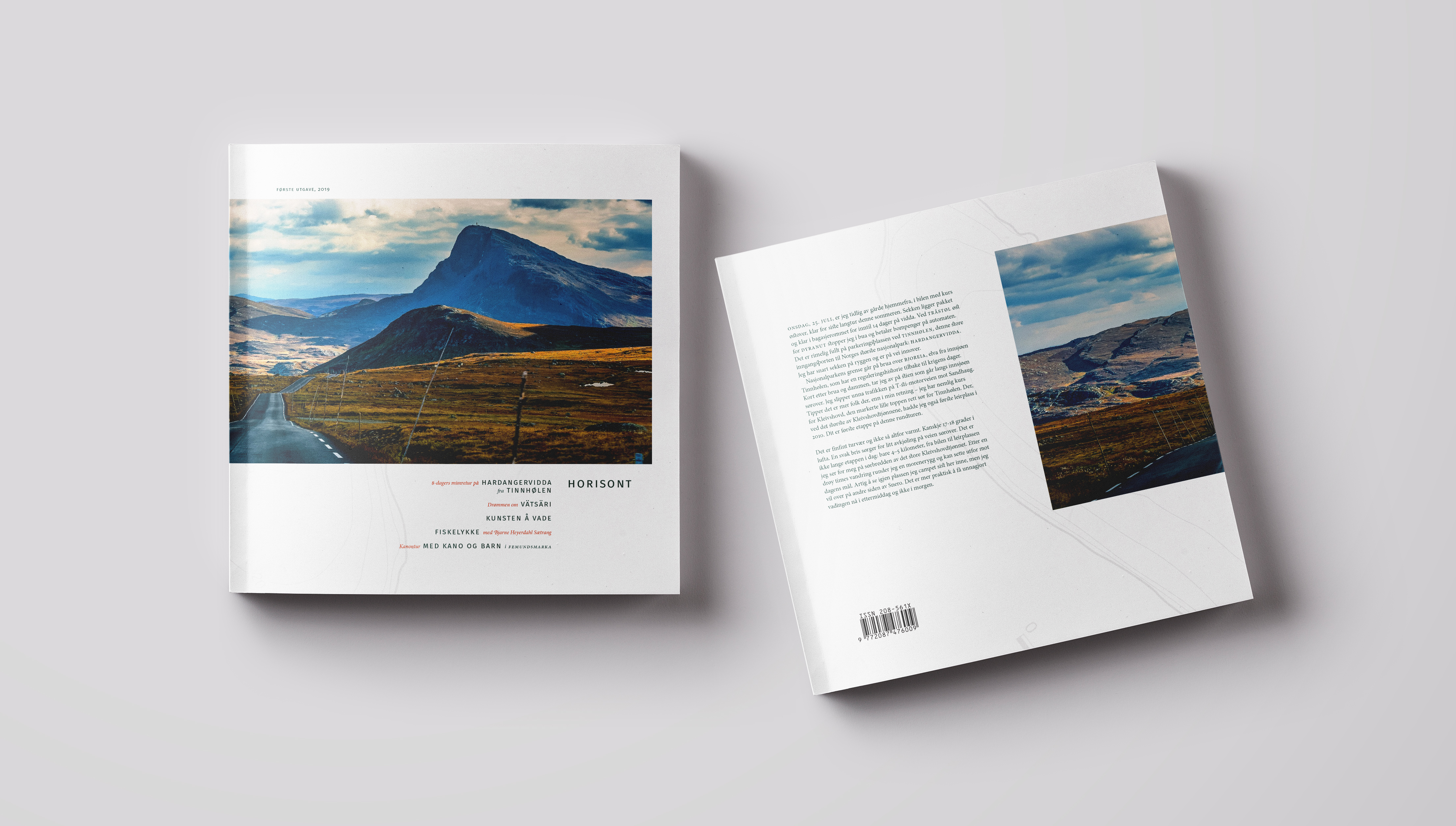
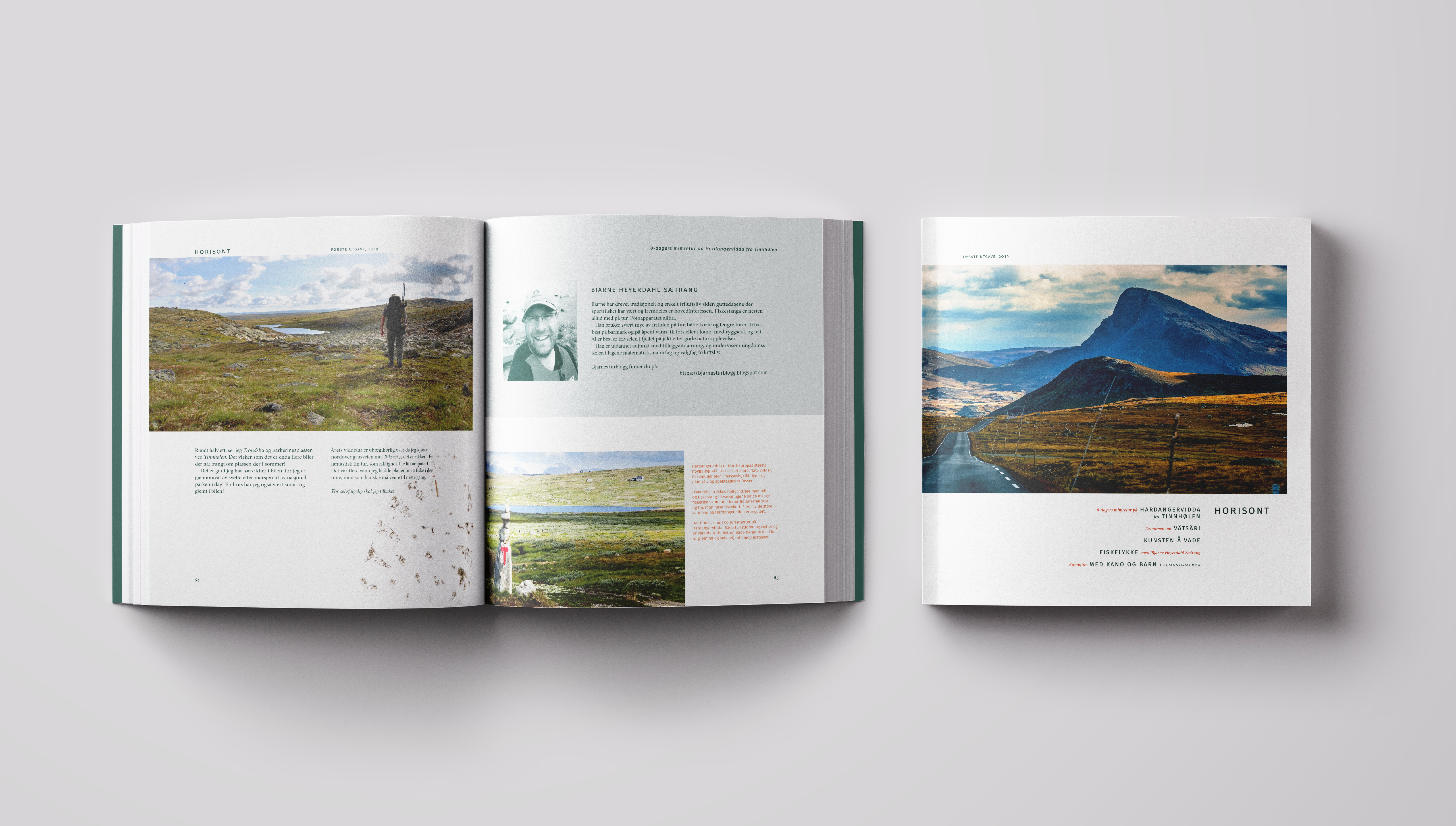
I used a square format for a lavish impression, and to facilitate horizontally oriented layouts and photography.
I deliberately played on the “horizontal” experience of reading books by visually referencing book design.
For the typeface, I sought humble, organic and natural forms, incorporating traditional and organic typographic features, such as discretionary ligatures and oldstyle numbers.
Columns are set ragged right, deliberately breaking convention to emphasise an organic character and the contours of natural landscapes.
Composition is asymmetrical but balanced, with diagonal movement.
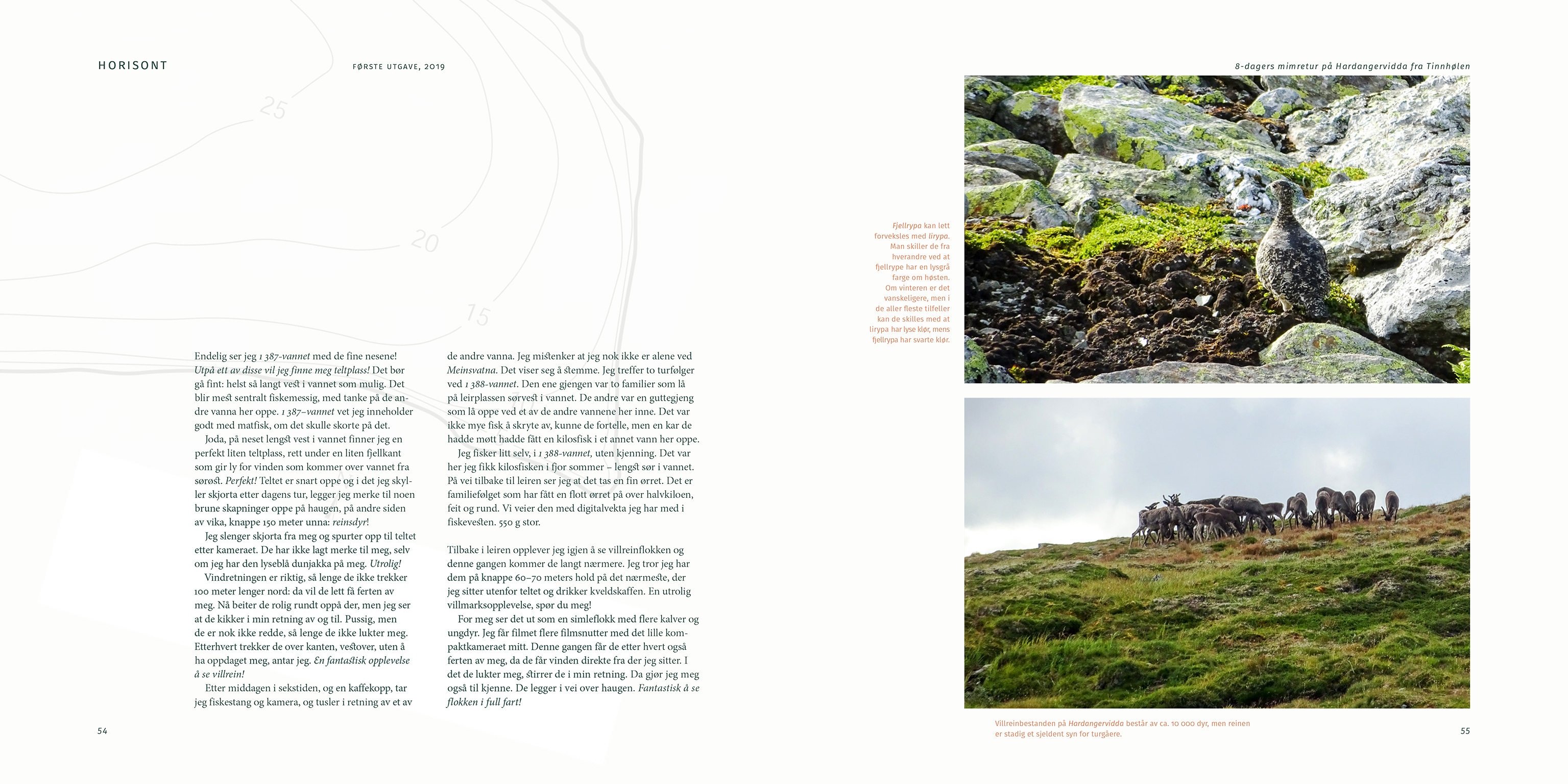
Photography was chosen to complement the storyline, and to convey the desired experience.
The composition of spreads through the magazine utilizes both coherence and variance from spread to spread.
Full-spread photography intervenes to break up monotony, and to generate compositional suspense.
The muddy footprint was used as an effect indicating the author moving on from the current to the next adventure, beyond the magazine.
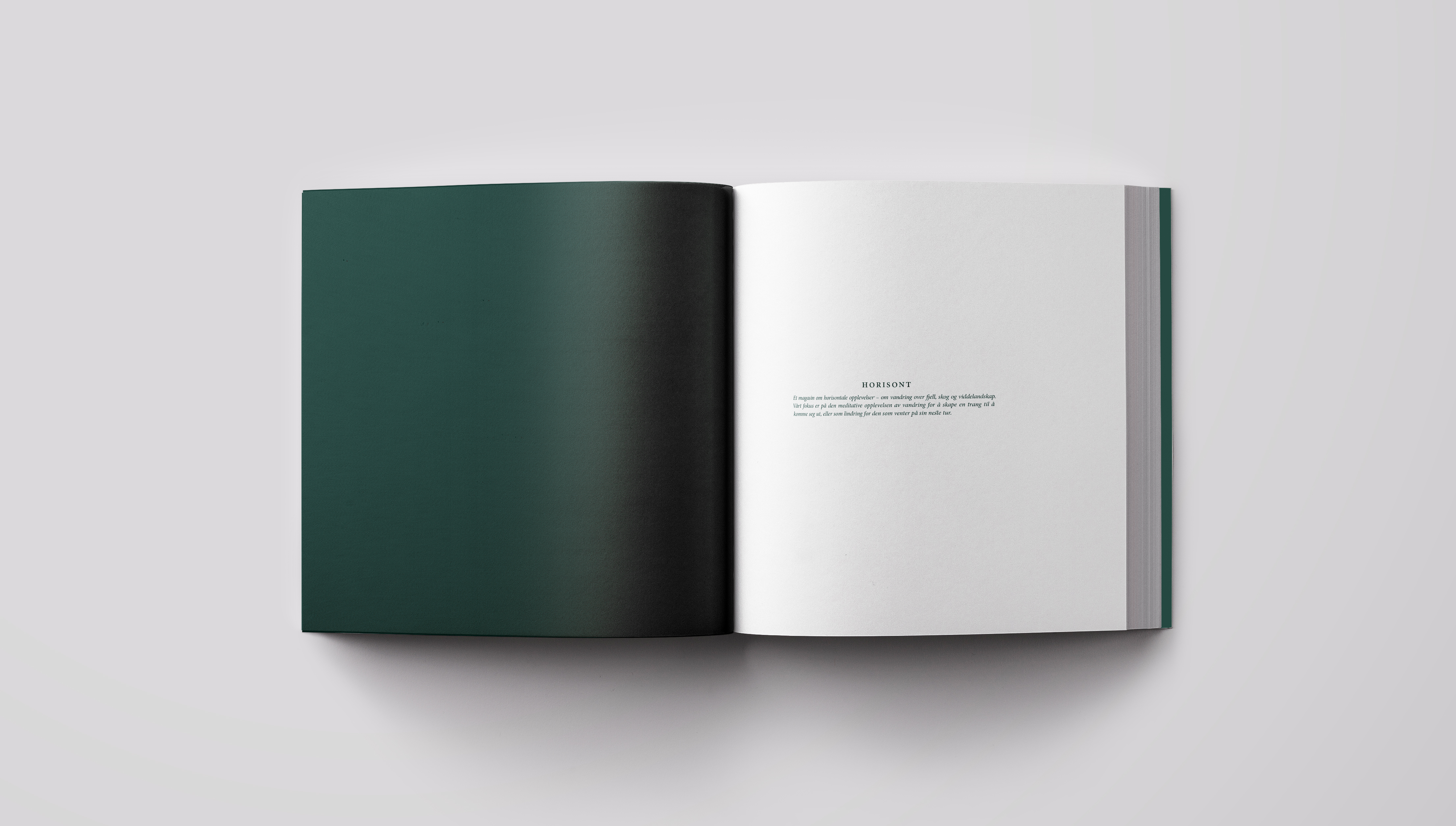
The cover spans front to back, drawing on the same attributes as on the inside.